Driveway Address Sign - VOTE!!
We’re planning a bit of an elaborate house sign at the front of our driveway. I’ve done two design sketches which are shown below.
So my question is, which one do we build? Whichever gets the most votes is the one we build!(facebook, email or in the comments below)
Not much variation in the theme (sea creatures) but I will take your preferences into consideration when creating the final abomination such as; should it feature more eyeballs, or fewer eyeballs? More squamous and batrachian creatures or fewer? More amorphous, or more defined?
In consideration of my neighbors nerves I’ve used great restraint, just hinting at the horrors that lurk in the stygian blackness of the sea floor just steps from our sleepy seaside town. To an unobservant person passing by under a gibbous moon through the dank fog crawling from the sea, this may appear to be something entirely familiar such as an octopus. It is not. Have I erred in judgement? Are my neighbors made of stouter stuff? Shall I test them further? Is a third rendition required?
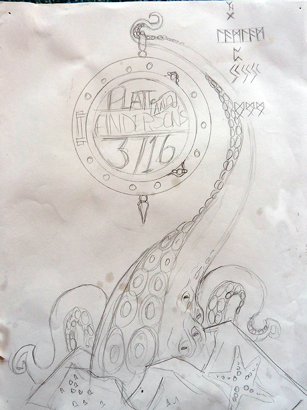
Here’s the first version standing at just over 6ft tall:
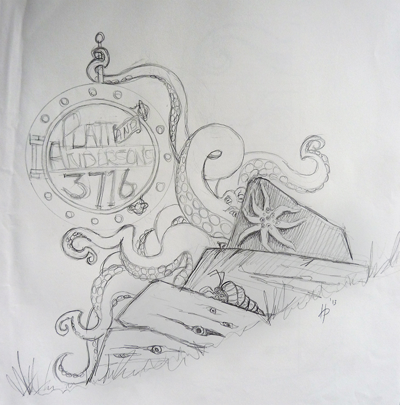
Second version at about 5ft tall:
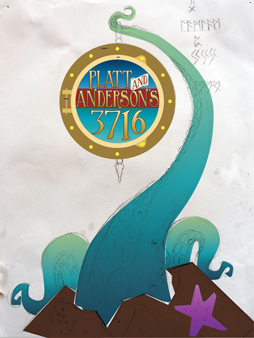
 Here’s a rough idea of some of the colours when it’s painted: